HNZ Constructions
HNZ Constructions required a refreshed identity that would strengthen its position as a premium shopfitting specialist in Sydney and Melbourne while signalling its capacity to operate on a broader stage.
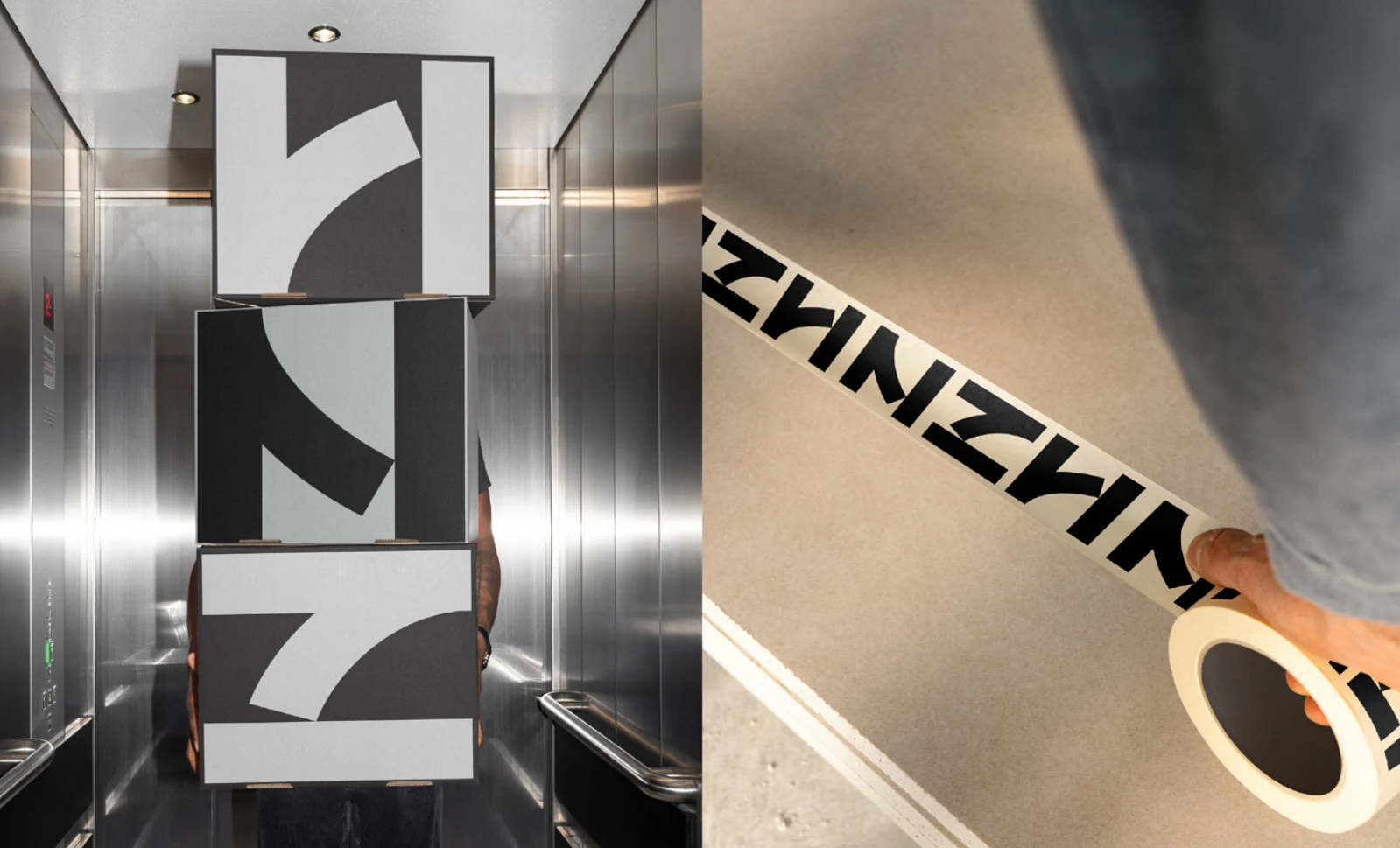
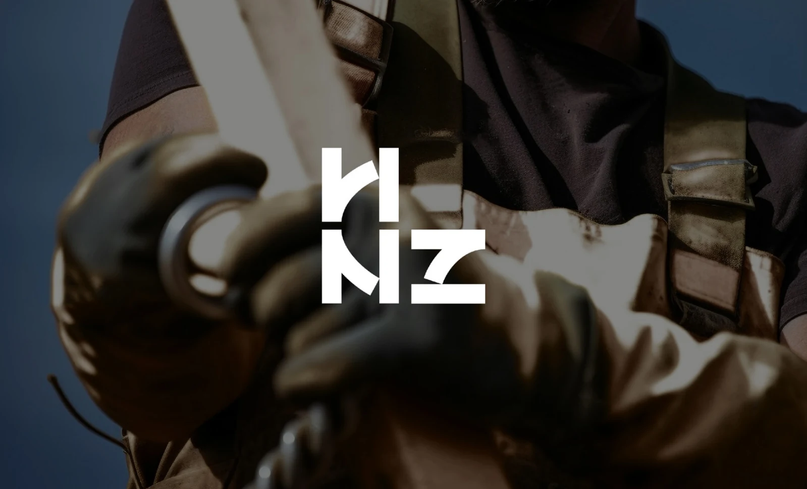
The identity is built around a single versatile symbol derived from the structural anatomy of the letters H, N and Z. By examining their underlying strokes, we identified a shared geometric framework reminiscent of the I-beams, joints and structural systems used in construction. Through rotation and reflection, the same abstract form can alternately be read as H, N or Z, creating a mark that feels both engineered and precise.
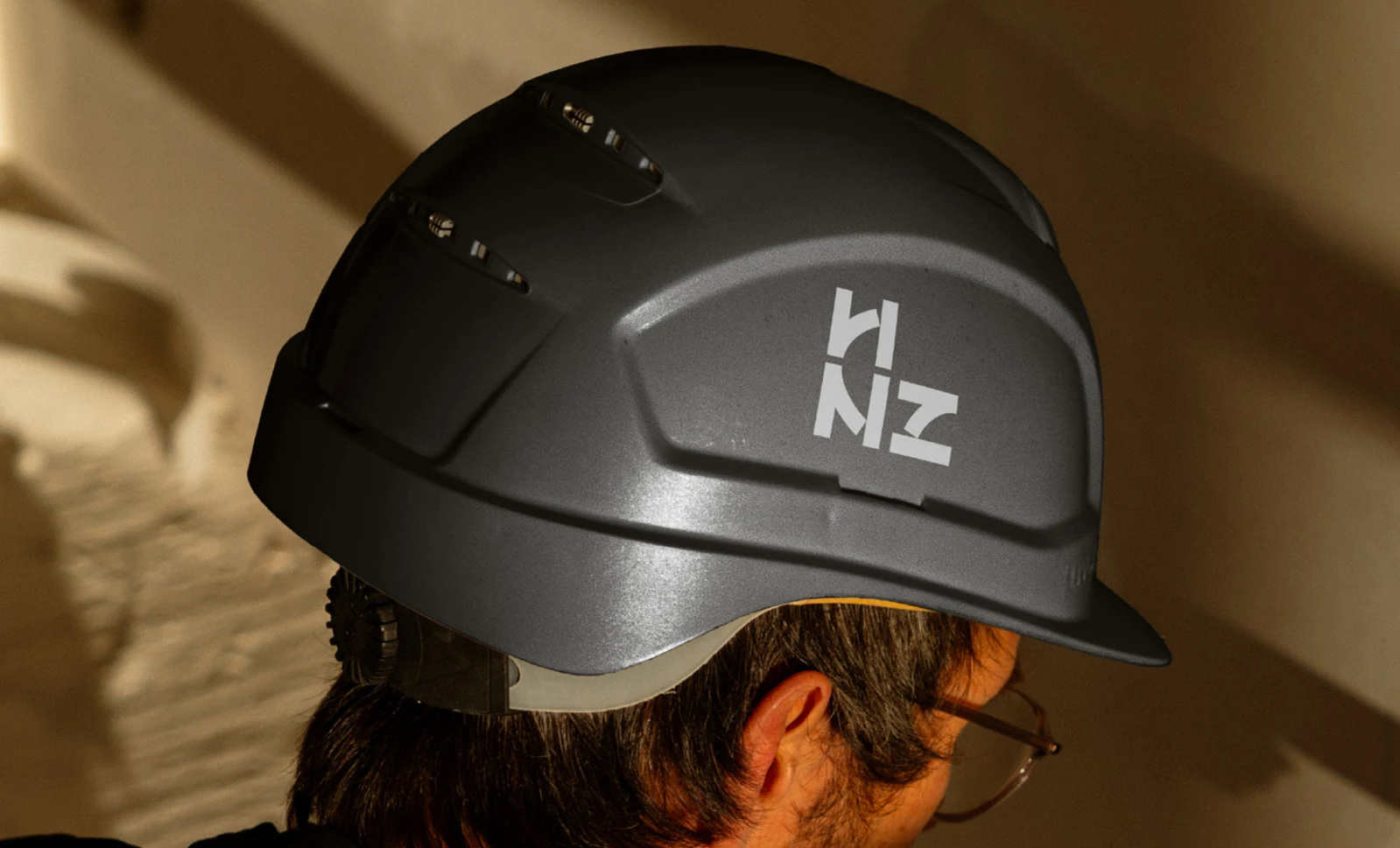
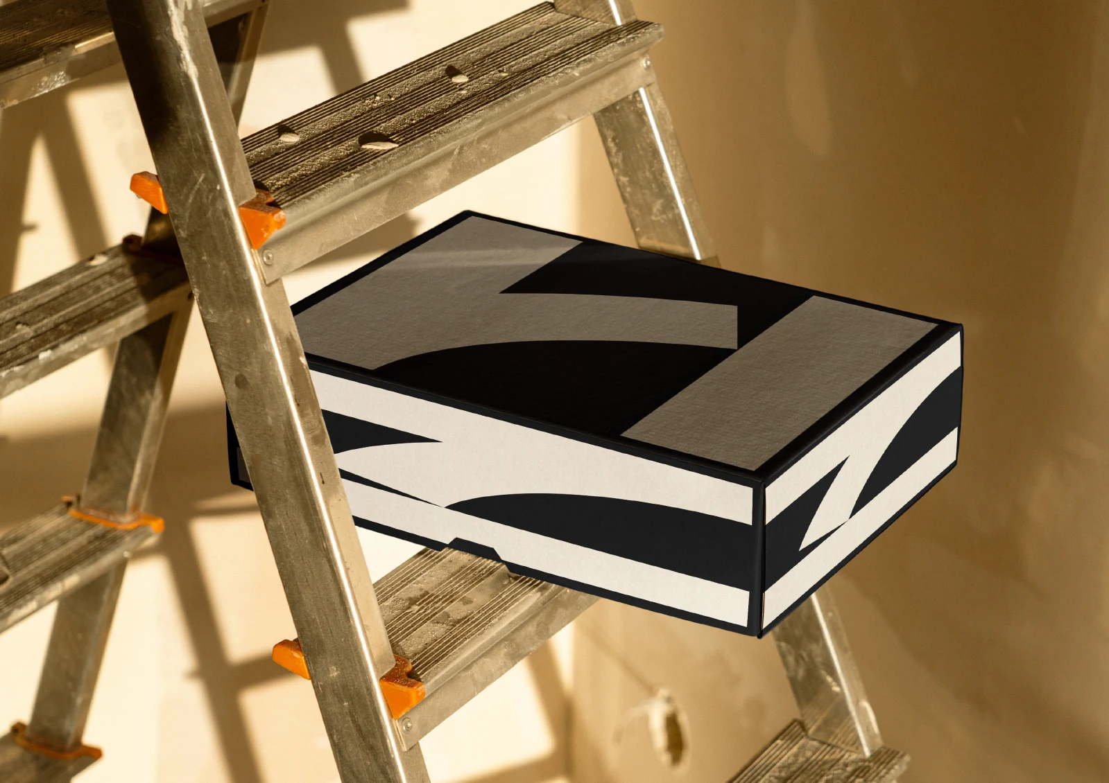
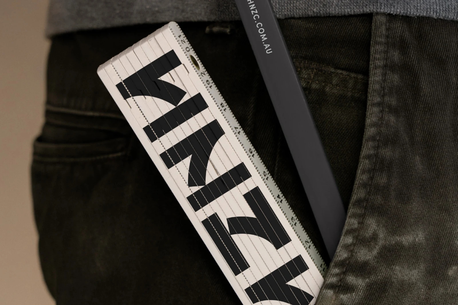
The symbol was designed to retain its clarity across scales, from hard-hat decals, stationery and digital proposals to vehicle liveries, site hoardings and large environmental applications. It can also be repeated as a modular pattern, evoking scaffolding and architectural grids.
A restrained palette of deep charcoal and light grey reinforces the identity’s sense of precision, reliability and professionalism while allowing the structural character of the symbol to remain the focus.
HNZ Constructions 需要一套更新的品牌識別,鞏固其作為雪梨與墨爾本高端商業空間工程專家的地位,同時展現走向更大舞台的能力。
識別的核心是一個從 H、N、Z 三個字母的結構拆解而來的符號。分析三者的基本筆畫後,我們找到一個共同的幾何骨架,令人聯想到營造工程中的工字鋼、接點與結構系統。透過旋轉與鏡射,同一個抽象形體可以分別被讀作 H、N 或 Z,成為一個兼具工程感與精準度的標誌。
這個符號在任何尺度下都保持清晰:從安全帽貼紙、事務用品、數位提案,到車體塗裝、工地圍籬與大型環境應用。它也能重複排列成模組化圖紋,呼應鷹架與建築格線。
深炭灰與淺灰的克制配色,強化了精準、可靠與專業的印象,也讓符號本身的結構性格成為焦點。
A shared structure三個字母,共用一個結構
The strokes of H, N and Z share a geometric framework. Rotation and reflection allow the same form to move between a single symbol and a complete wordmark.H、N、Z 的筆畫共用一個幾何骨架。透過旋轉與鏡射,同一個形體可以組成獨立符號,也可以排列成完整字標。
On site進入施工現場
The mark keeps a clear outline on a helmet, then expands into cropped shapes and repeated lettering for signage and tape. These applications connect the identity to the tools and surfaces of construction.標誌在安全帽上保留清楚的輪廓,也能放大、局部取用,或重複排列成指標與膠帶。識別因此直接進入工程現場的工具與物件。