Selected work作品選輯
Identity, editorial, exhibitions
and design research. 2017–now.品牌識別、書籍、展覽與設計研究。
2017 至今。
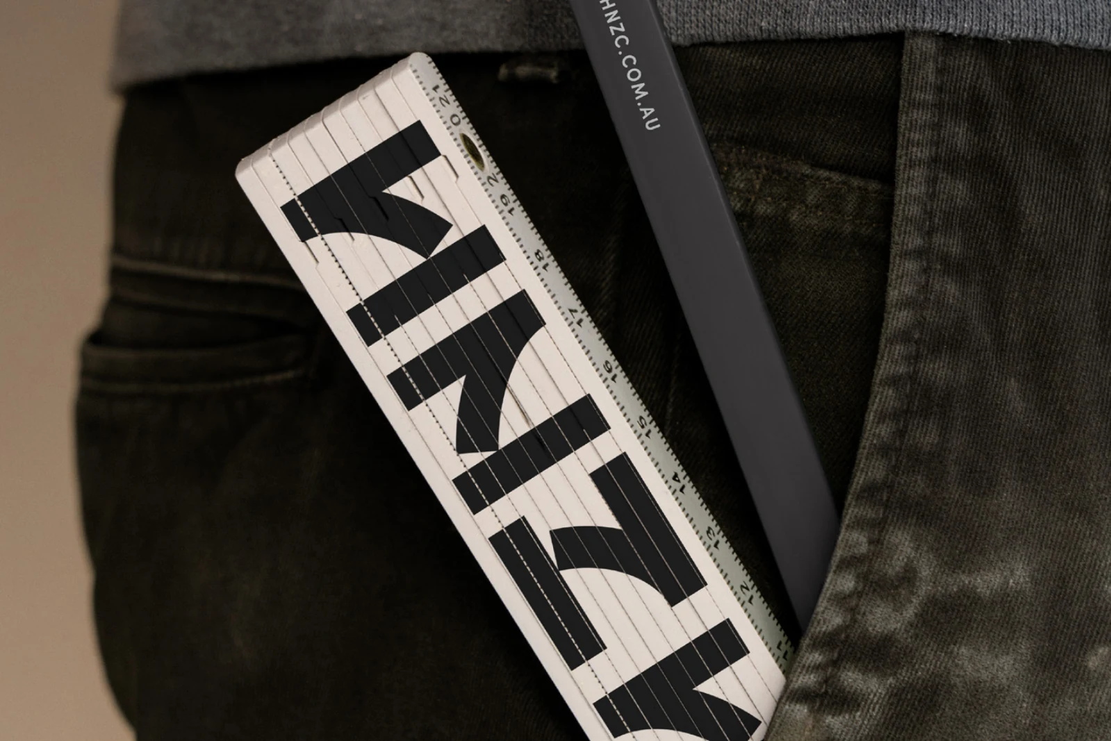
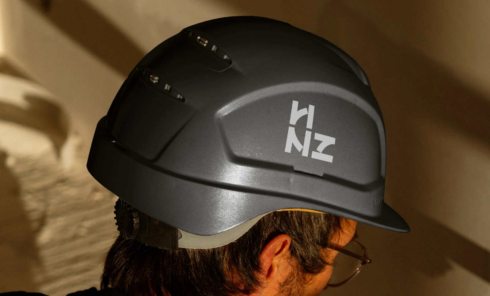
- HNZ ConstructionsFor a commercial fitout company, the letters H, N and Z share one geometric structure, echoing steel beams and construction joints. Rotation and reflection turn it into a flexible identity that carries from rulers and workwear to helmets, signage and site tape.為商業空間工程公司建立識別,從 H、N、Z 的共同筆畫找出幾何骨架,呼應鋼梁與結構接點。透過旋轉、鏡射與重複排列,同一個形體從尺與工作服延伸到安全帽、現場指標及膠帶,連結品牌與施工日常。

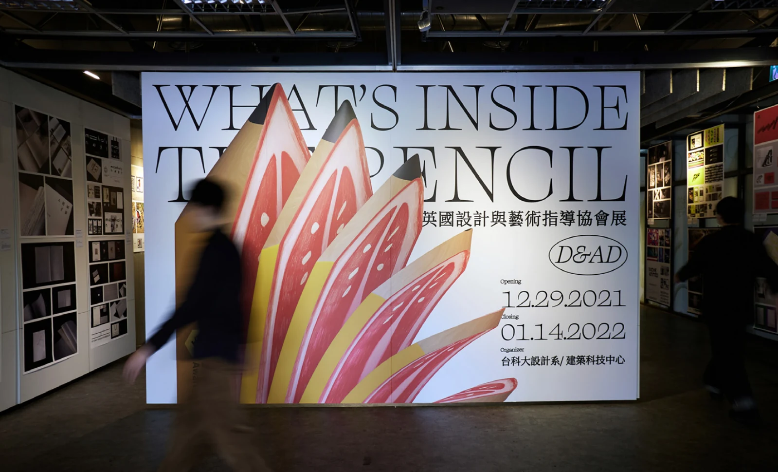
- D&AD Exhibition in Taiwan 2021D&AD 設計展在台灣 2021D&AD’s coloured pencils are sliced open to reveal fruit, bringing the award’s familiar symbol into a Taipei setting. The idea moves from a series of posters to an oversized entrance installation, giving visitors a different view as they enter the exhibition.把 D&AD 的彩色鉛筆剖開,露出鮮豔的水果切面,將獎項的代表符號與台北的在地意象結合。從系列海報到入口的巨型鉛筆,同一個內外翻轉的構想延伸成展場體驗,引導觀眾走近、探索熟悉形體裡的另一面。
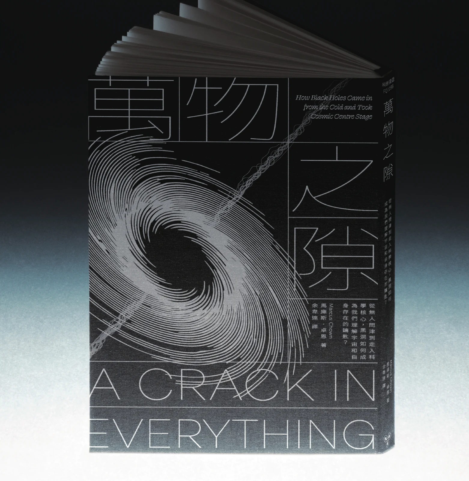
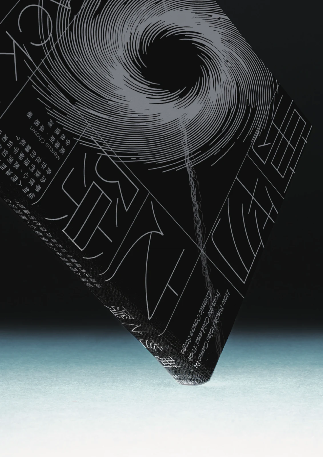
- A Crack in Everything萬物之隙A book about black holes becomes a study in gravitational pull on the page. Fine, swirling lines draw the eye towards a central void, while stretched typography joins the same movement, giving an invisible astronomical force a visible role in the cover’s composition.這本探討黑洞的書,把引力轉化為封面的構圖方式。細密的旋轉線條向中央空洞聚攏,延展的書名也被帶入同一股動勢;圖像與文字一起呈現拉扯、扭曲與深度,讓看不見的天文力量有了可以閱讀的形狀。
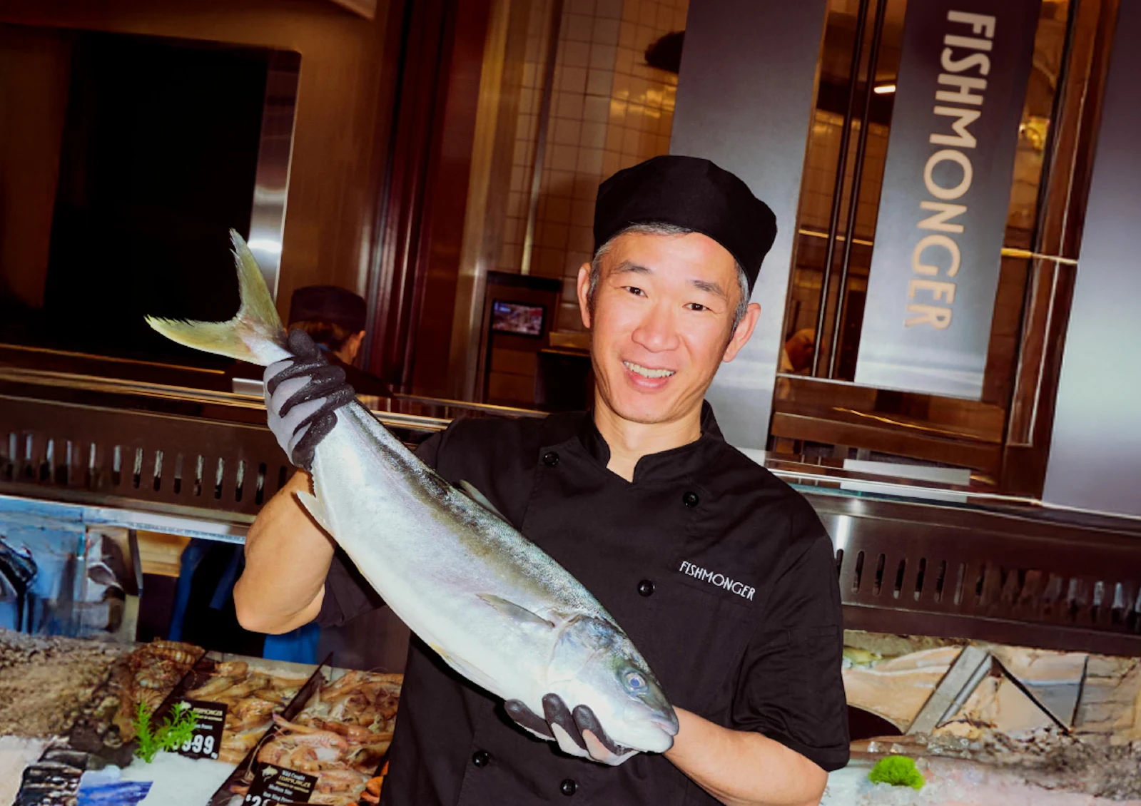
- FishmongerFor a seafood shop and restaurant in Melbourne’s Chadstone, a custom wordmark draws on the long, streamlined profile of a fish. Its proportions work across the illuminated shopfront and small printed pieces, supported by patterns abstracted from fish scales, water and rice.為墨爾本 Chadstone 的海鮮鋪與餐廳設計識別,以魚身的流線發展出修長、高腰的專屬字標。相同的比例貫穿店面發光招牌與小型印刷物,並將魚鱗、水與米轉化為輔助圖紋,延伸到菜單、包裝與制服。

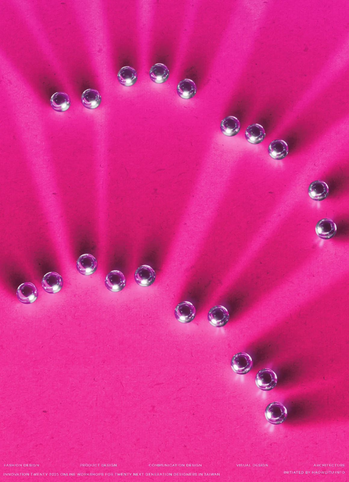
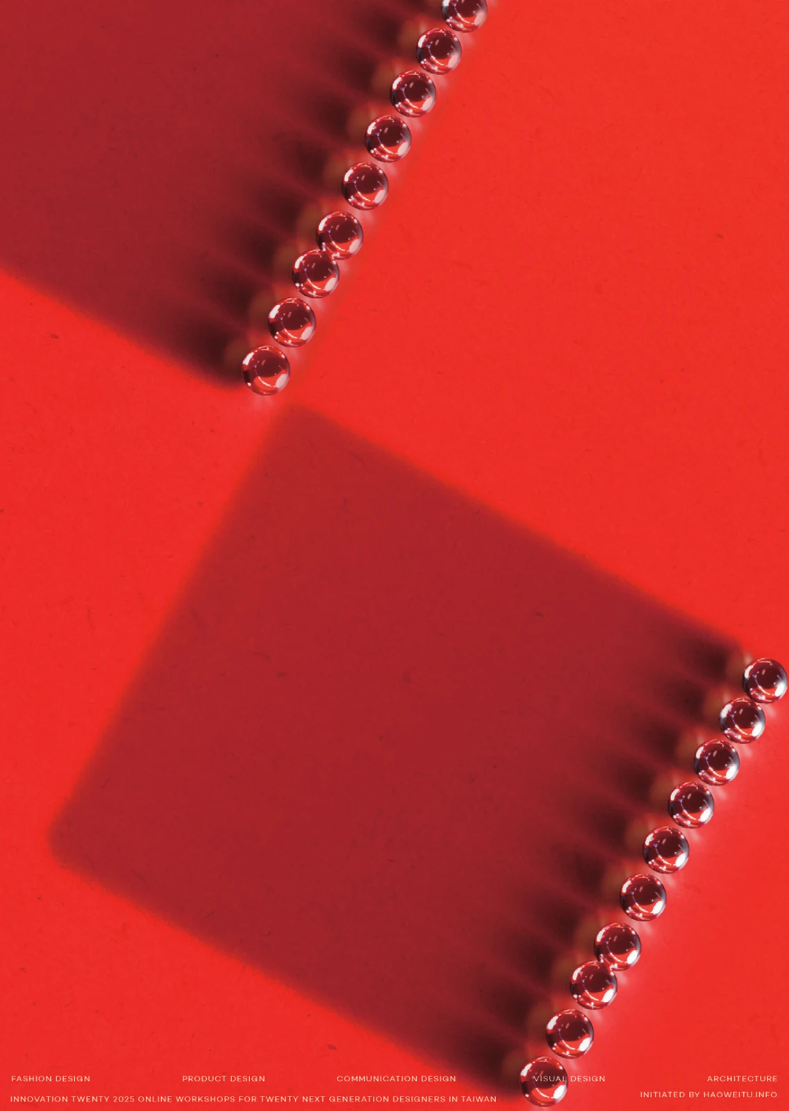
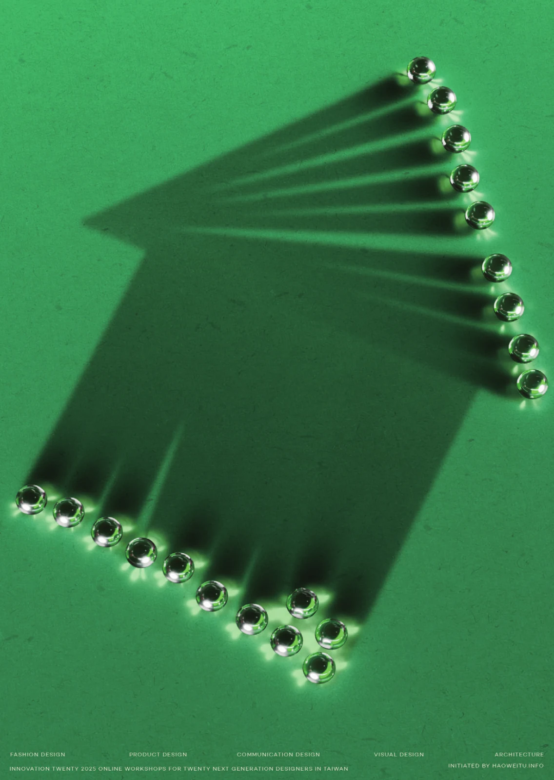
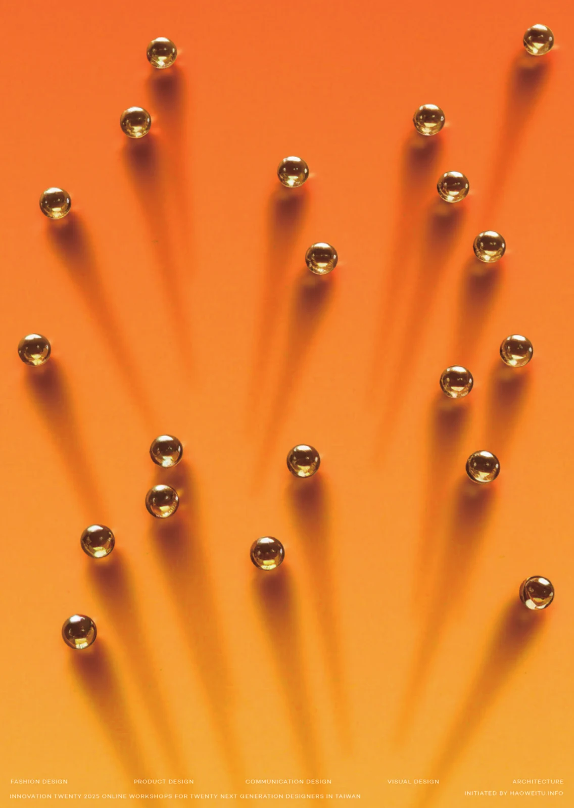
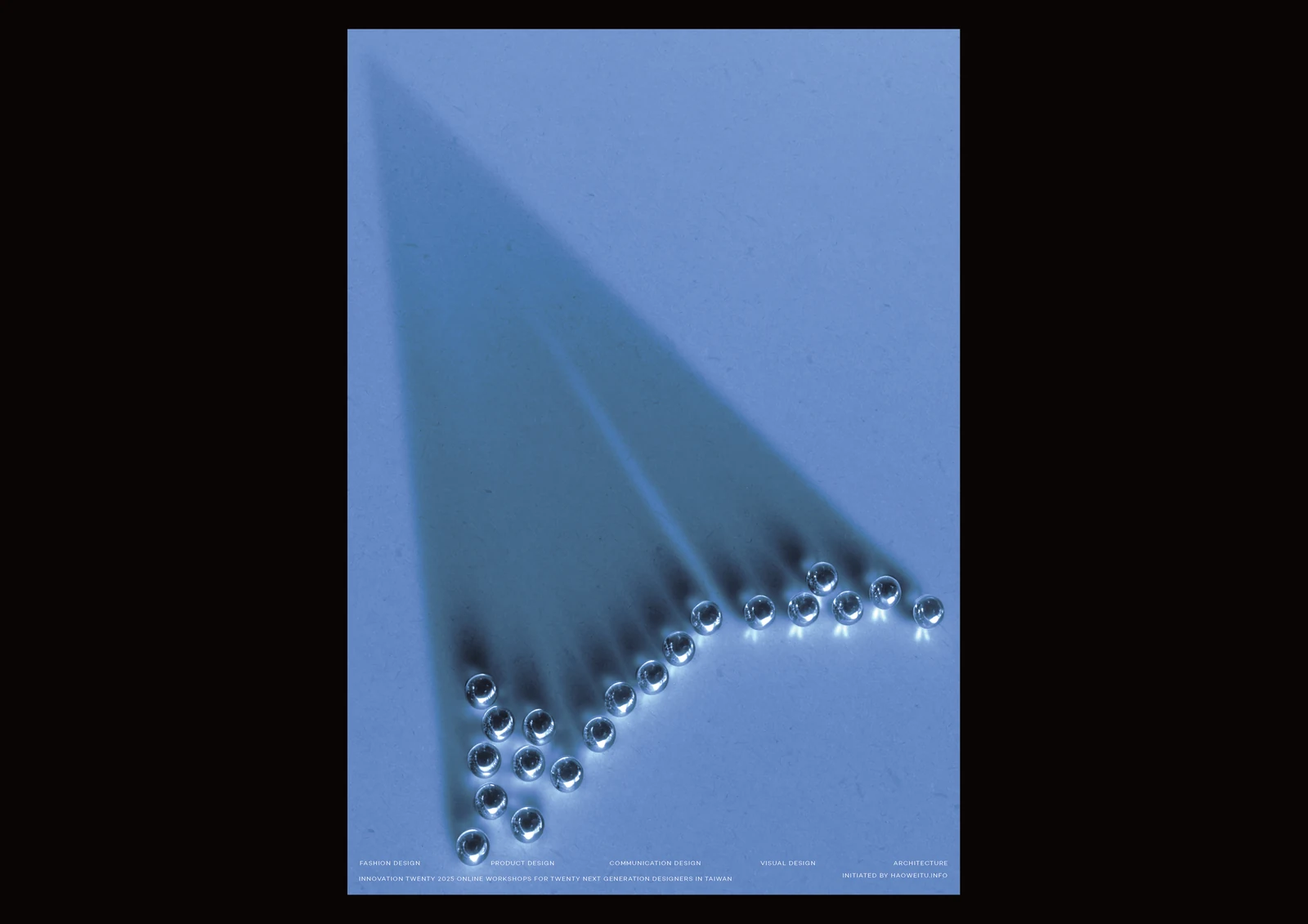
- Innovation TwentyFive design disciplines come together in an identity for an online workshop for twenty emerging designers. Paper planes, needles and other discipline-specific symbols are shaped in metallic forms, with colour and directional light giving each poster its own character within a shared photographic approach.為二十位新銳設計師參與的線上跨領域工作坊建立識別,以紙飛機、針、房屋等符號對應五個設計領域。金屬形體與定向光線構成共同的攝影語言,再藉由色彩、輪廓與陰影的變化,讓五張海報各自成立,也形成一個系列。
- EndoAwareAn identity for an endometriosis screening programme, built around the yellow awareness ribbon. A continuous hand-drawn line moves through portraits, animation and the screening bus, connecting public health information with the people and the often lengthy diagnostic journey at the centre of the project.這套子宮內膜異位症篩檢計畫的識別,以黃色關懷絲帶作為貫穿整體的線索。連續的手繪線條穿過人物攝影、動畫與篩檢巴士,把健康資訊連回人的經驗,也讓經常不被看見的症狀與漫長的確診歷程成為視覺焦點。
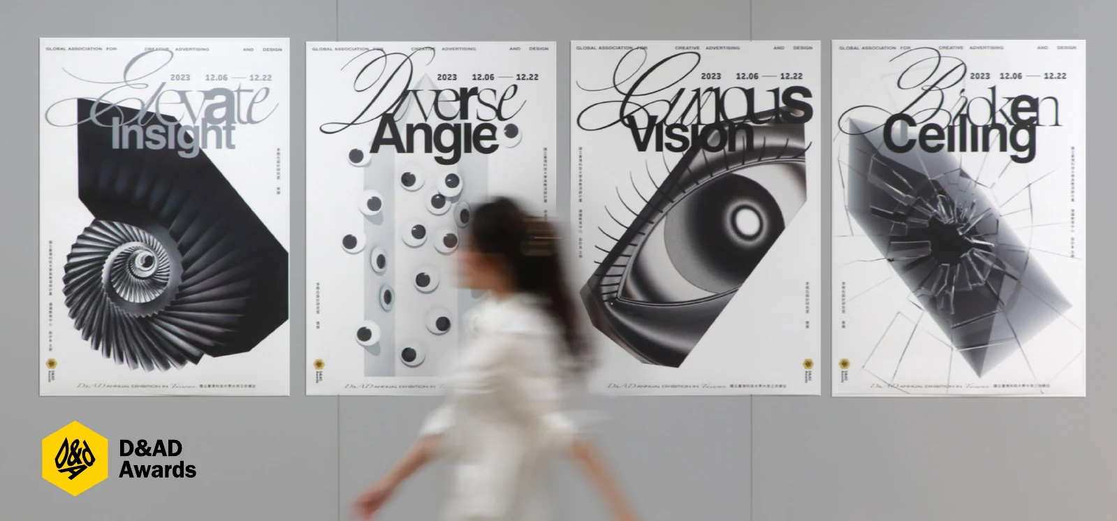
- D&AD Exhibition in Taiwan 2023D&AD 設計展在台灣 2023The D&AD pencil returns as an exercise in looking from different angles. Four monochrome compositions explore insight, perspective, vision and boundaries through optical transformations and typography, with motion extending the idea across posters and into the Taipei exhibition’s printed matter and objects.以 D&AD 鉛筆為起點,為台北巡迴展設計一系列關於觀看的練習。四組黑白構圖透過光學變形、文字與動態,探討洞見、角度、視野及邊界,並延伸至展覽印刷物與觀眾可拿起的物件,讓熟悉圖像在不同視角下改變。
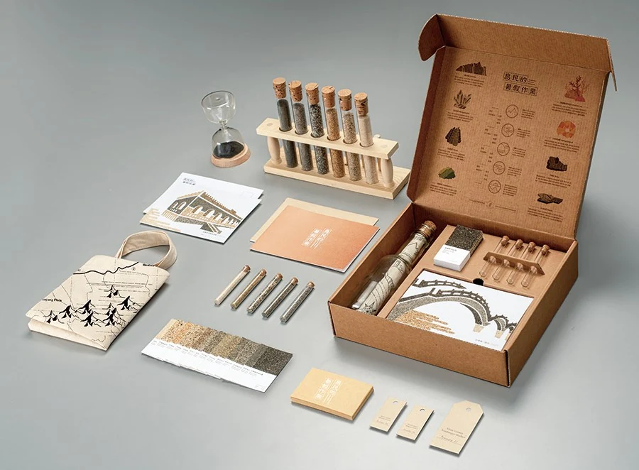
- Islander’s Summer Homework島民的暑假作業Coastal sand research becomes a summer homework kit for exploring Taiwan. Maps, sample tubes, colour swatches and postcards turn differences in sand colour and texture into things to collect, compare and make with, linking a journey along the coast to learning through observation.從台灣各地海岸沙樣的研究出發,把暑假作業重新設計成一組旅行與觀察工具。地圖、採集管、色票與明信片,將沙的顏色與質地差異轉化為可採集、比較及製作沙畫的材料,讓海岸地理成為親手探索的內容。
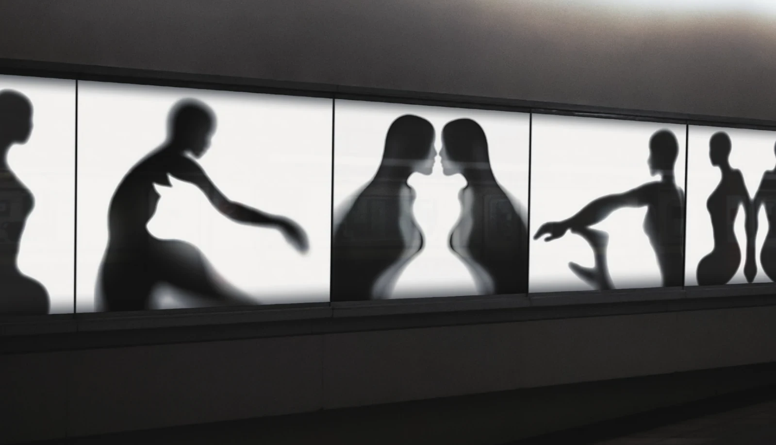
- Projection & Figure–Ground投影與圖地反轉Master’s research into making figure–ground illusions through projection. Objects, silhouettes and the spaces between them become the material for a ten-step design method, developed through poster experiments and tested in a workshop to make an intuitive visual process easier to plan and repeat.這項碩士研究透過投影探索圖地反轉,觀察物件、剪影與形體之間的空間如何產生雙重圖像。研究將創作整理為十個步驟,再以海報實驗與工作坊測試,讓原本依賴直覺的視覺手法,成為可以規劃、觀察與重複操作的過程。
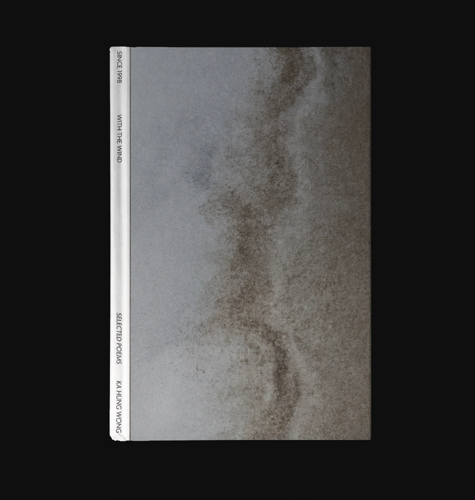
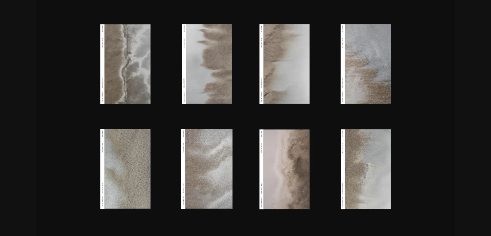
- With the WindFor a collection of poems, drifting sand gives wind a visible trace. Changes in density and direction run through eight cover variations, while quiet typography and muted surfaces leave room for the material to suggest movement, passing time and the poems’ lingering emotion.以飄移的沙,為詩集裡看不見的風留下可見的痕跡。八種封面變化保留相同的書本形式,讓沙的密度與流向改變構圖;克制的文字和低彩度表面,則把注意力留給材質的細微動勢,呼應詩中的短暫與餘韻。
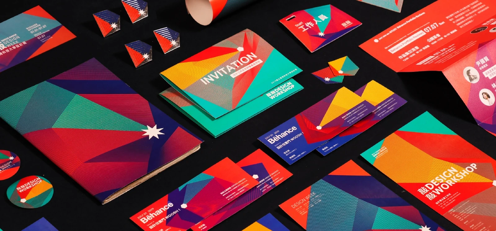
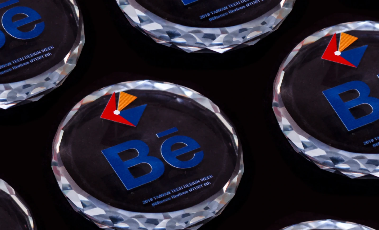
- Taiwan Tech Design Week臺科大設計週A knock on a door becomes the identity for a design week of exhibitions, talks and workshops. Geometric door shapes, a white point of contact and radiating colour turn sound into graphics, recombined across invitations, badges, animations and portfolio review materials.為結合展覽、講座與工作坊的臺科大設計週,把敲門的動作轉化為識別。幾何化的門、白色敲擊點與向外展開的色塊,將聲音畫成圖形,再重新組合於邀請卡、識別證、動畫與作品集評閱物件,串起不同活動。
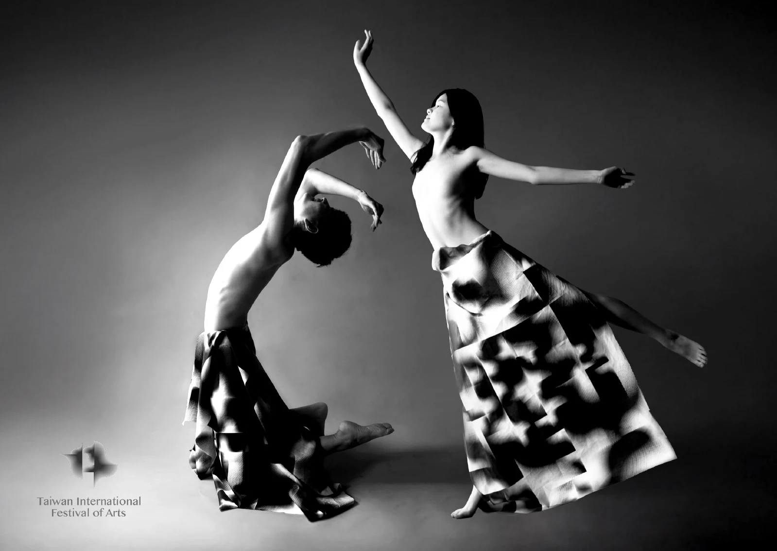
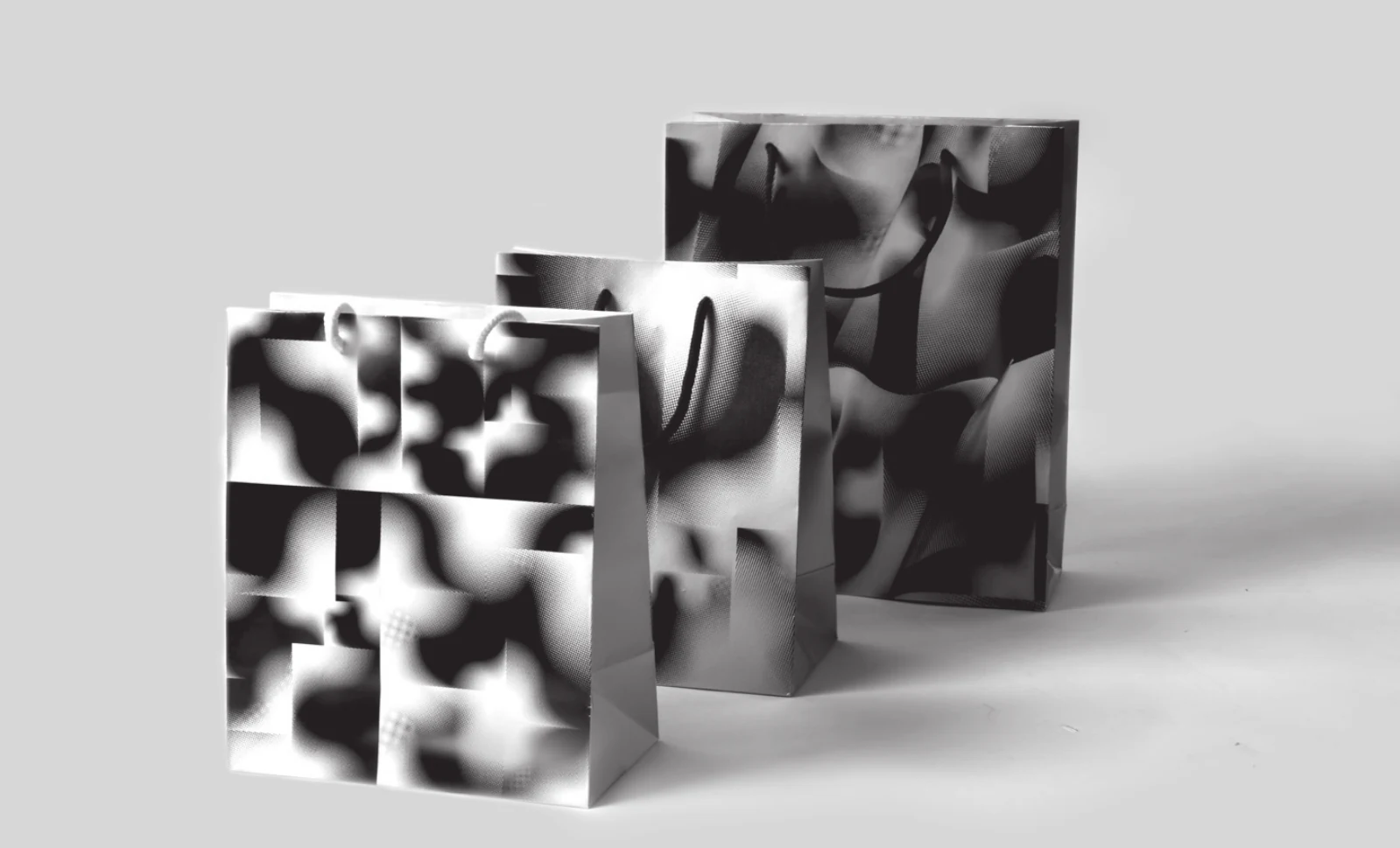
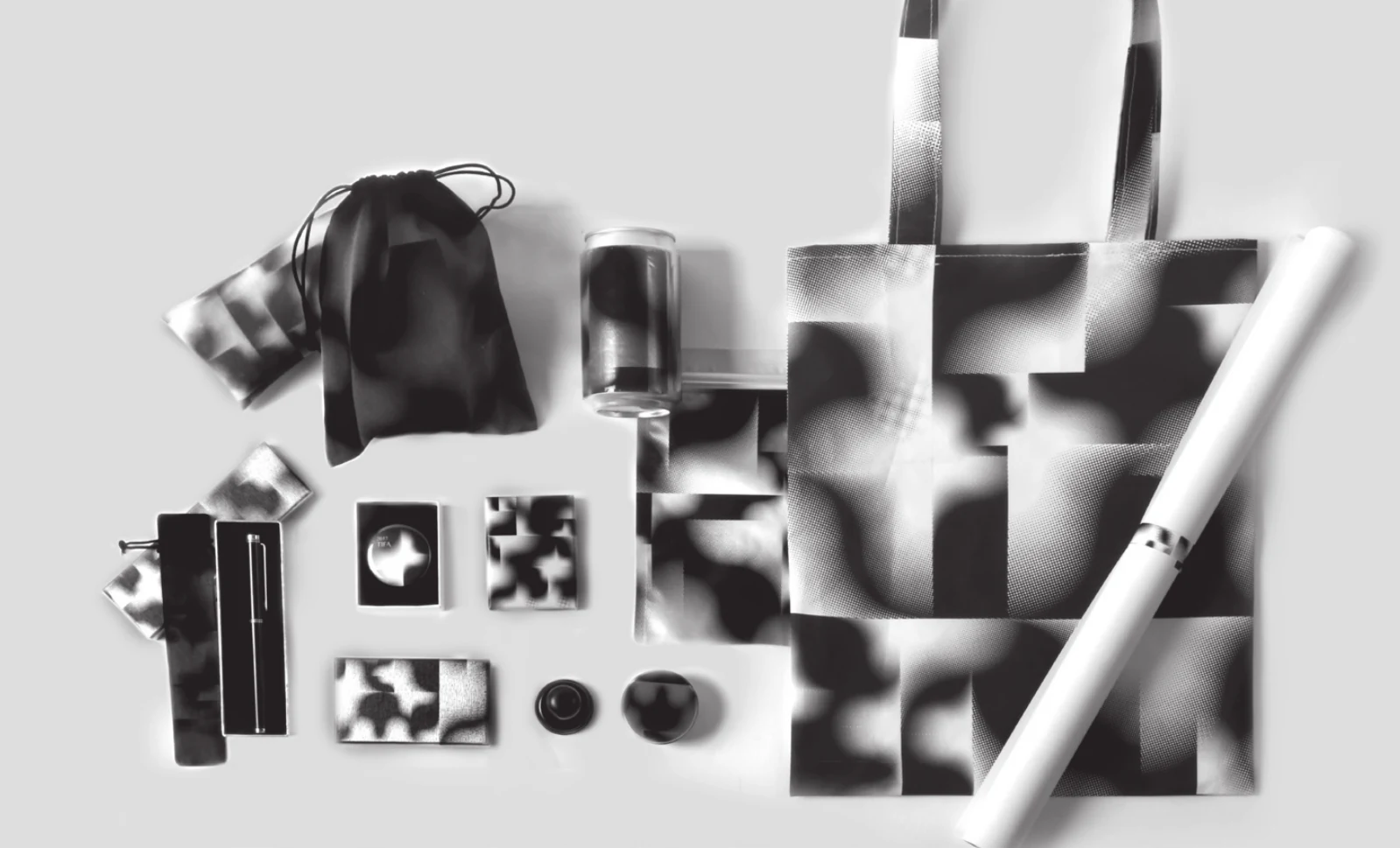
- Taiwan International Festival of Arts臺灣國際藝術節Piano keys, dance and musical notation meet in a split-square graphic for the festival’s theme, Everlasting. Repeated across fabric and printed matter, the module changes scale and rhythm; photographed on moving bodies, its flat geometry takes on folds, depth and the gestures of performance.為藝術節「永恆」主題設計分割方塊模組,將琴鍵、舞姿與樂譜記號收進同一個圖形。黑白圖紋隨尺度與排列產生節奏,印上布料後又透過身體與攝影形成摺痕、深度及動勢,從平面印刷延伸到表演的姿態。
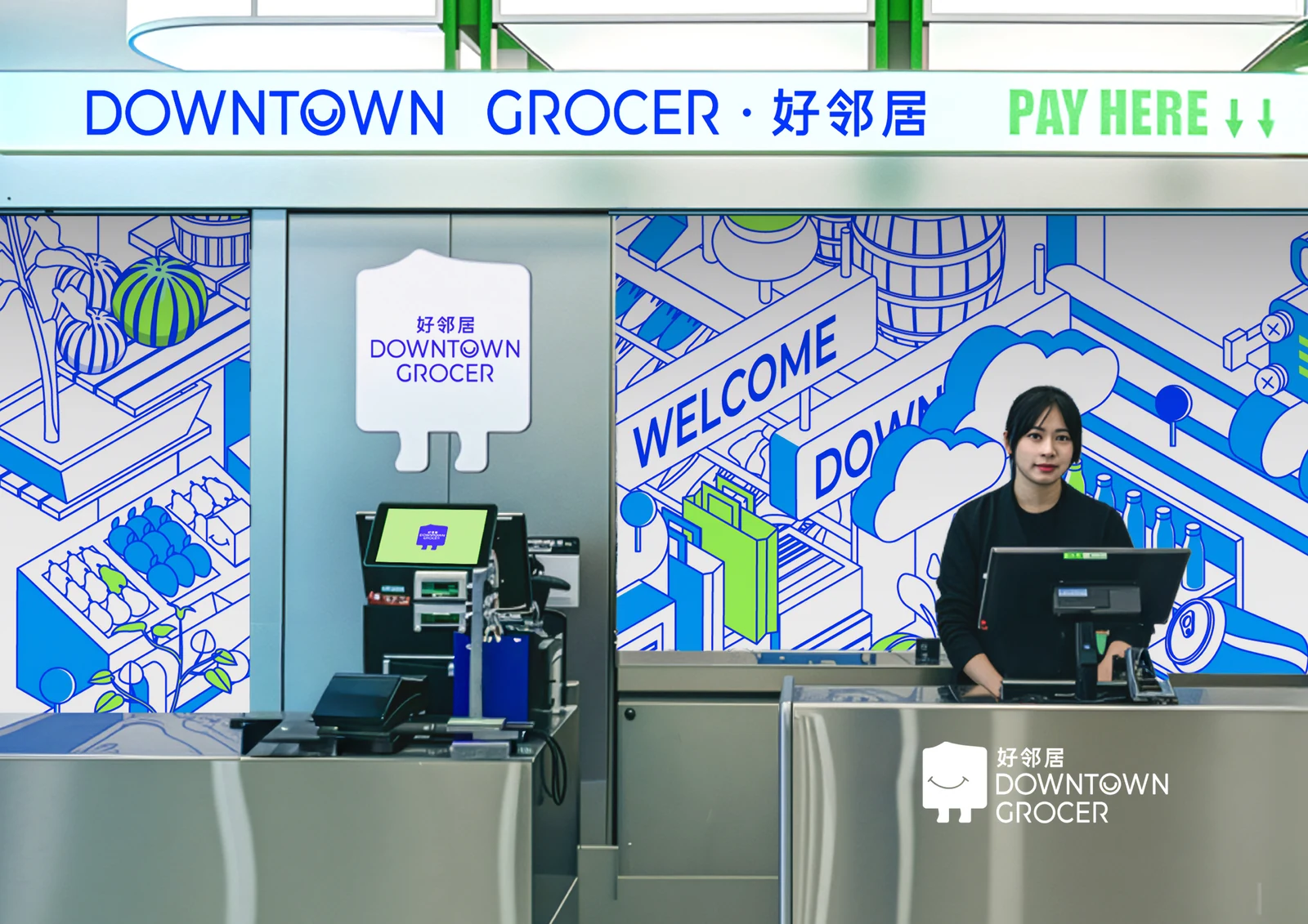
- Downtown Grocer好鄰居 Downtown GrocerA smiling square mascot welcomes shoppers to an Asian supermarket in Melbourne’s Chinatown. Electric blue, neon green and an isometric drawing of the shop connect the sign, checkout and packaging, with modular illustrations that can be rearranged for seasonal celebrations and promotions.為墨爾本唐人街的亞洲超市設計微笑的方形角色,以電光藍與螢光綠建立鮮明識別。店內的米袋、推車與店員被畫成模組化等角插畫,串連招牌、收銀台與包裝,也能隨節慶重新組合,讓日常商店延伸出不同場景。

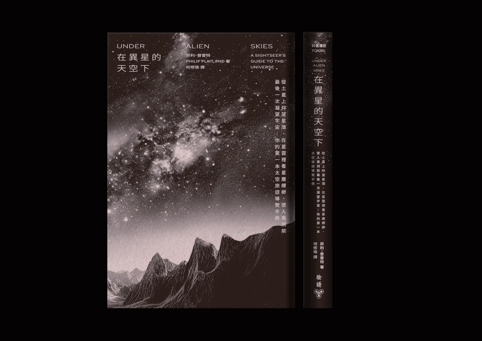
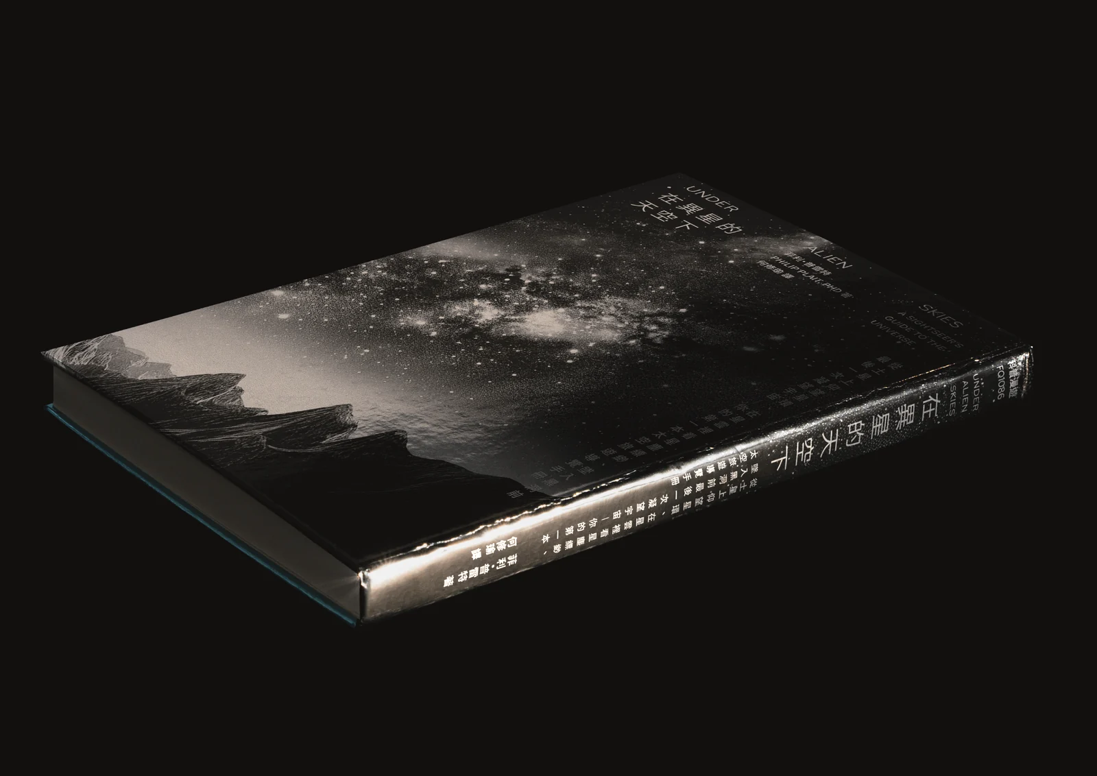
- Under Alien Skies在異星的天空下A space-travel guide seen from the traveller’s point of view. A mountain horizon places the reader beneath a star-filled sky, while the cover, spine and silver page edges bring that distant scene into the scale and reflective surfaces of a physical book.這本太空旅行指南的封面,從旅人的視角呈現宇宙:群山的地平線讓讀者有了仰望星空的位置。封面與書脊承接遙遠的景象,銀色書口則在光線下形成反射,將星空的廣闊與一本書可以拿在手中的尺度連在一起。
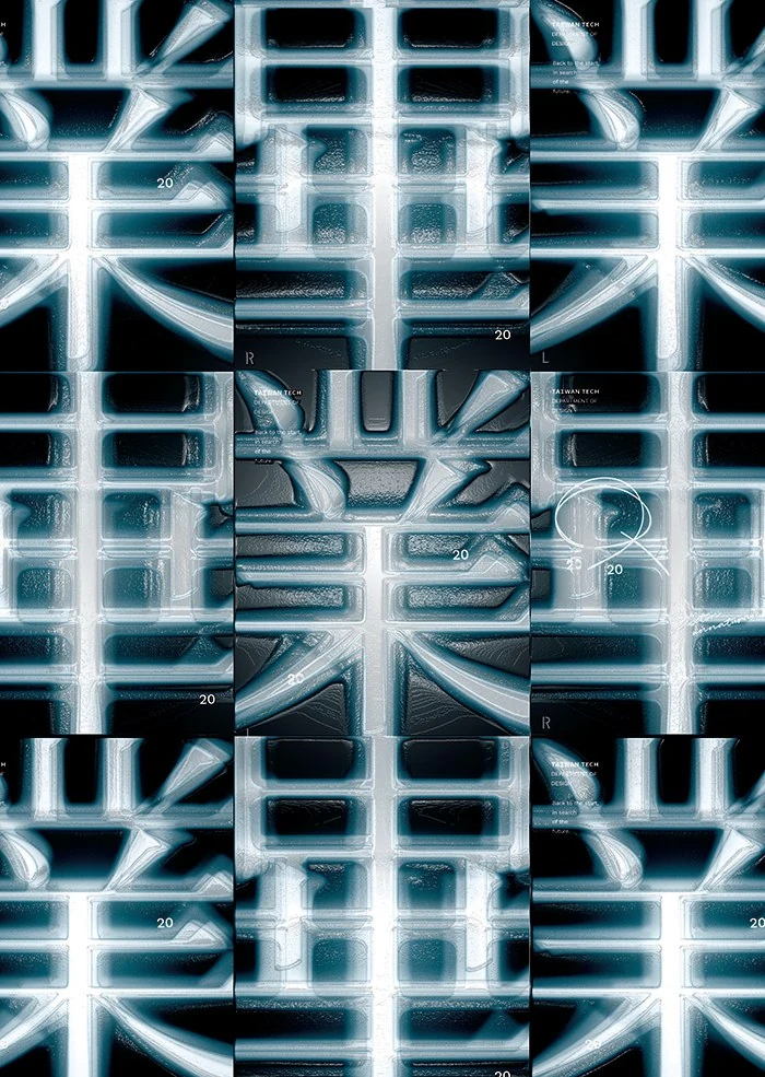
- Taiwan Tech Design Graduation Exhibition臺科大設計系畢業展Ming characters are examined like skeletal structures for Taiwan Tech’s graduation exhibition. X-ray textures, enlarged strokes and shifting fragments turn the theme of returning to the beginning into a typographic system, moving between full poster compositions and details on passes and lanyards.以明體字的筆畫骨架為核心,回應臺科大畢業展「回到原點,尋找未來」的主題。X 光片般的質感、局部放大與字形拆解,讓文字成為可被檢視的結構,從系列海報的完整構圖延伸到識別證與掛繩上的細節。