Fishmonger
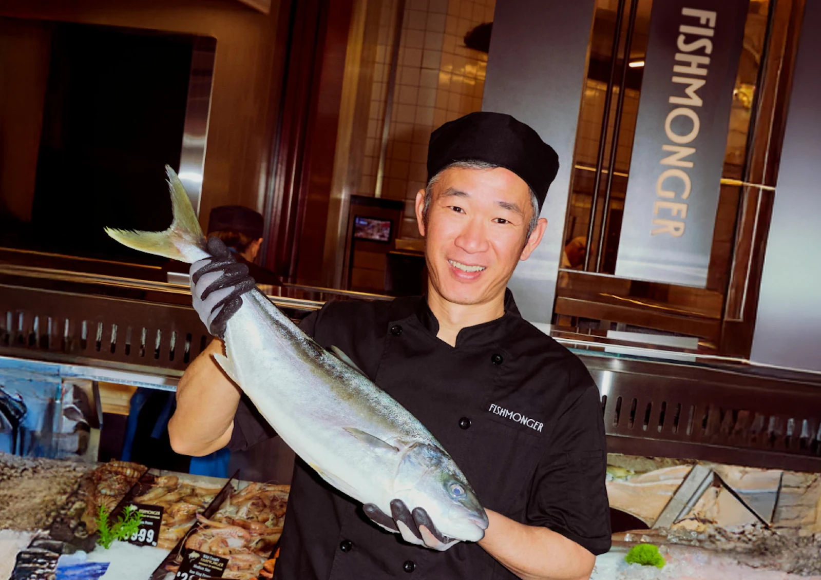
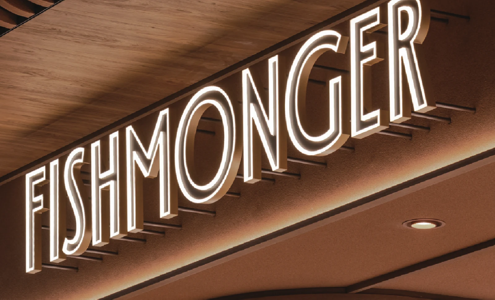
Fishmonger is a premium seafood purveyor and dining destination at Chadstone Shopping Centre in Melbourne. The identity needed to communicate refinement and quality while remaining appropriate to the intimate, timber-framed and dark-toned interior. The logotype also had to maintain a strong presence across a ten-metre shopfront while remaining legible in smaller digital and printed applications.
At the centre of the identity is a bespoke wordmark with elongated, high-waisted letterforms that subtly evoke the streamlined profile of a fish. The upward movement of the characters introduces elegance and fluidity while retaining enough visual weight to communicate permanence and quality.
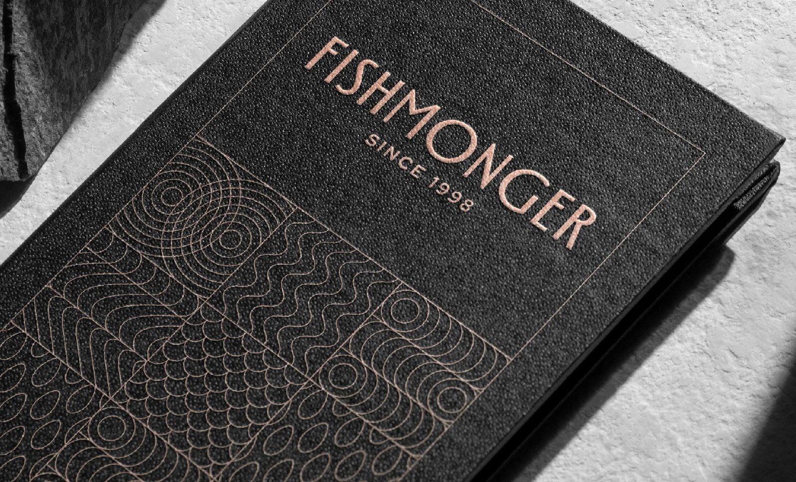
A secondary graphic system abstracts three elements central to the brand — fish, water and rice — into modular motifs. Radiating arcs reference fish scales, waveforms suggest moving water, and compact oval forms evoke grains of rice.
These elements can operate subtly through embossing and tone-on-tone applications or expand into bold patterns across packaging, uniforms and environmental graphics, allowing the identity to remain coherent while adapting to different scales and contexts.
Fishmonger 是位於墨爾本 Chadstone 購物中心的高端海鮮鋪與餐廳。品牌識別必須傳達精緻與品質,也要契合店內私密、木質框架與深色調的空間;字標既要撐得起十公尺寬的店面,也要在小尺寸的數位與印刷物上保持清晰。
識別的核心是一組專門設計的字標:修長、高腰的字形,隱約呼應魚身流線的側影。字母向上的動勢帶來優雅與流動感,同時保留足夠的份量,傳達穩重與品質。
輔助圖形系統把品牌的三個核心元素——魚、水、米——抽象化為模組圖紋:放射狀的弧線取自魚鱗,波形暗示流動的水,緊湊的橢圓則像一粒粒米。
這些元素可以低調地以壓印、同色系方式出現,也可以放大成醒目的圖紋,延伸到包裝、制服與空間圖像,讓識別在不同尺度與情境中保持一致。
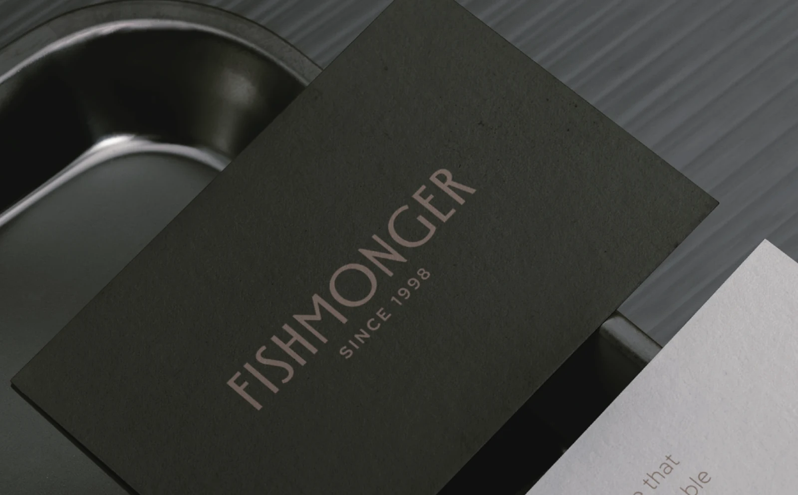
The wordmark at two scales字標的兩種尺度
Elongated, high-waisted letters suggest the streamlined profile of a fish. The same proportions give the wordmark a distinct presence on a small card and across the illuminated shopfront.修長、高腰的字形呼應魚身的流線。同一組比例,讓字標在小卡片與店面發光招牌上都保有鮮明的輪廓。
Material and pattern材質與圖紋
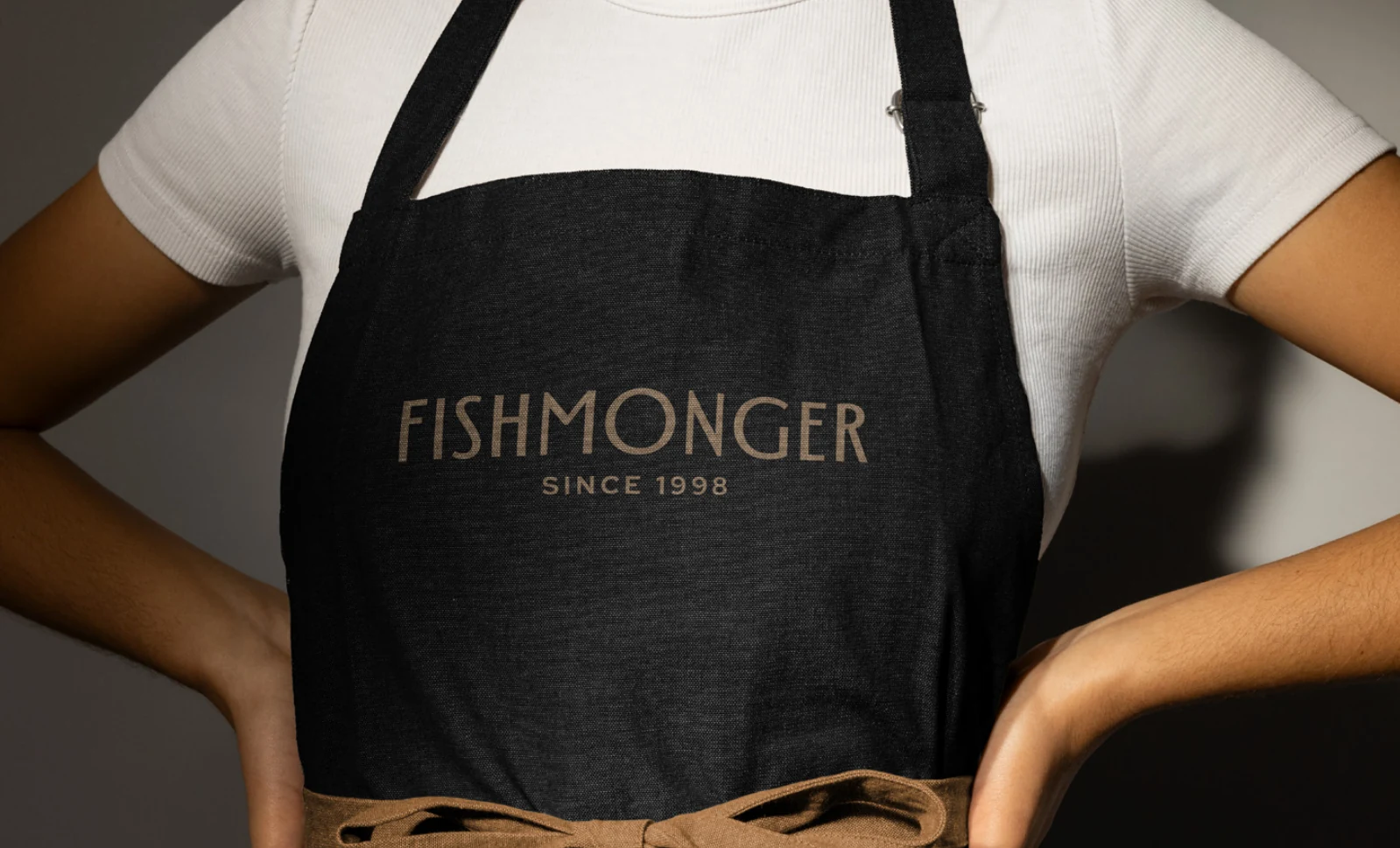
On an apron, the wordmark works on its own. On the menu, modular lines drawn from fish, water and rice add a second layer to the identity without competing with the lettering.圍裙上只留下字標;菜單則加入取自魚、水與米的模組線條。輔助圖紋提供另一層細節,同時讓文字保持清楚。