Taiwan Tech Design Graduation Exhibition臺科大設計系畢業展
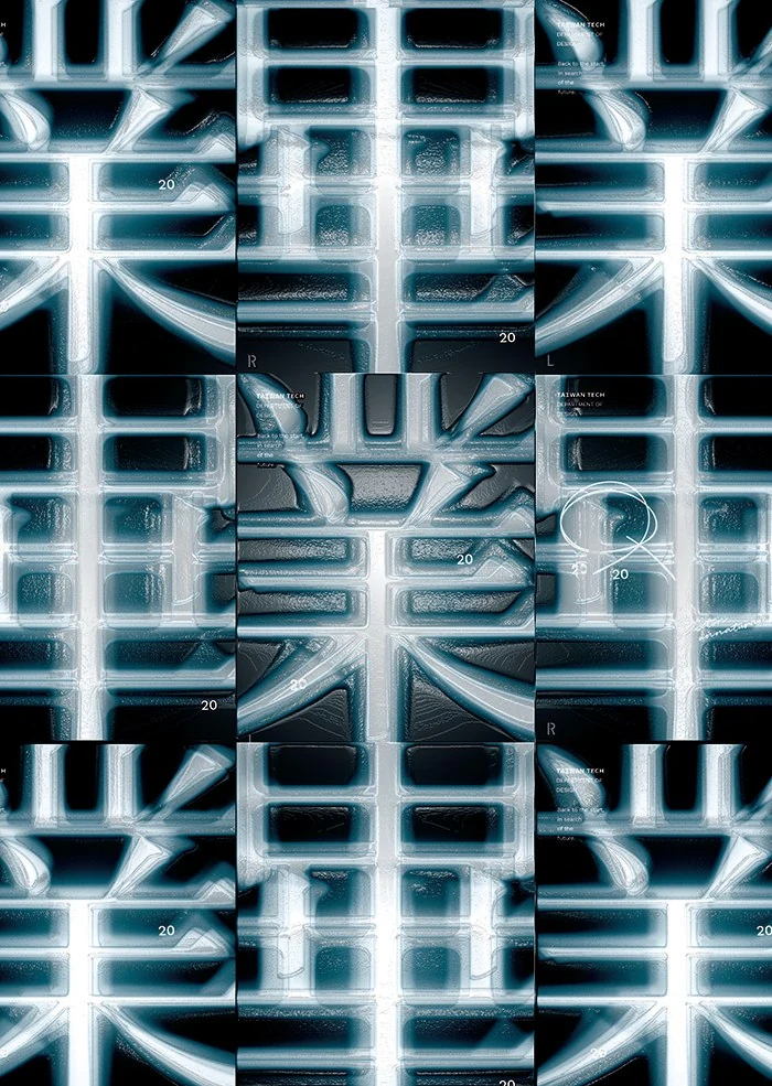
“Back to the start, in search of the future” was the theme of the exhibition. We drew seven different typefaces to talk about the comparisons designers constantly make, and used the look of X-ray film to suggest that design, like medicine, is about finding what lies beneath the surface.
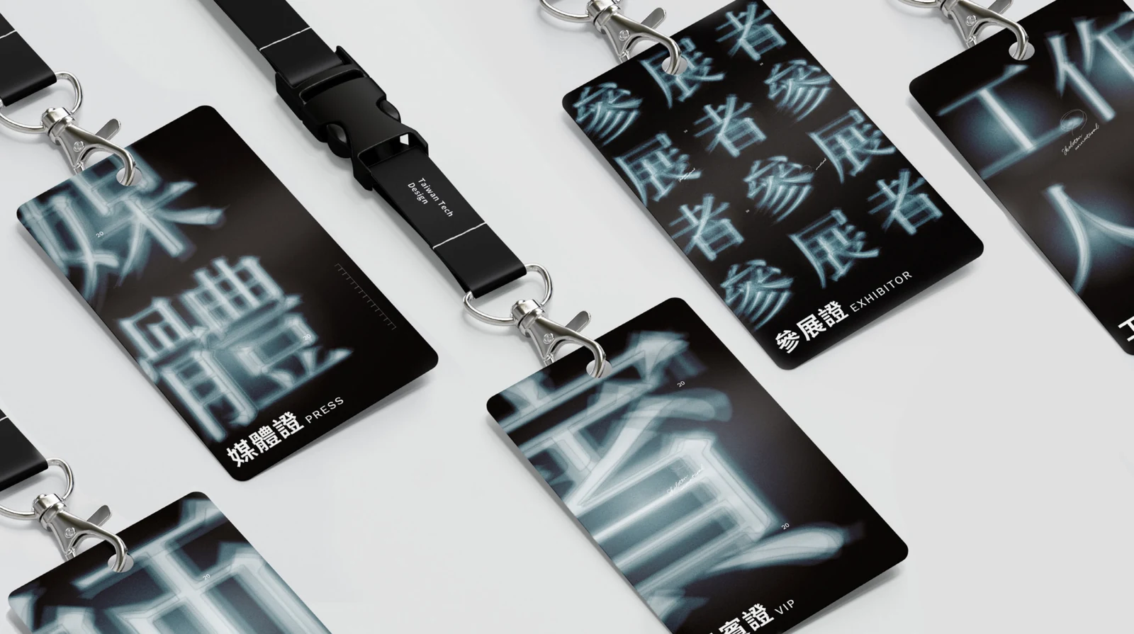
Ming, the classic Chinese text typeface, became the base of the identity because its strokes resemble a skeleton. The system develops through three transformations, two characters and a single magnified detail, repeated and varied across posters, passes, badges and street banners.
展覽的主題是「回到原點,尋找未來」。我們繪製七種不同的字體,談設計中不斷進行的比較;並借用 X 光片的質感,暗示設計就像醫生找出潛在的傷口,是在看見表面底下的東西。
識別以明體為基礎,因為它的筆畫很像骨骼。系統以三種變化、兩個字與一處局部放大延伸,在海報、識別證、徽章與街旗上反覆變化。
A visual system in print字形延伸成印刷系統
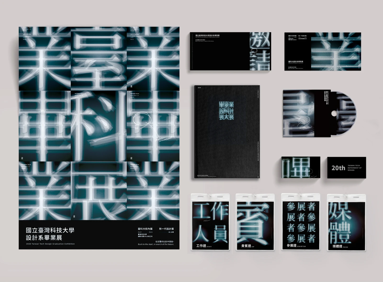
The same luminous character fragments connect the poster series with the exhibition’s printed material. Shifts in scale bring the lettering from a full composition into smaller details.同一組發光的字形碎片,串連海報與展覽印刷品。透過尺度的轉換,文字既能形成完整構圖,也能成為小面積物件上的視覺細節。
Reading the character’s structure閱讀字的骨架
Ming letterforms are treated as structures that can be enlarged, fragmented and examined. On passes and lanyards, the glowing strokes carry the exhibition’s X-ray reference into objects worn by visitors.明體被視為可以放大、拆解與檢視的結構。發光的筆畫延伸到識別證與掛繩,讓 X 光片的視覺意象進入觀眾配戴的物件。